| Layout |
| Video Display |
Thumbnails |
Two featured spots |
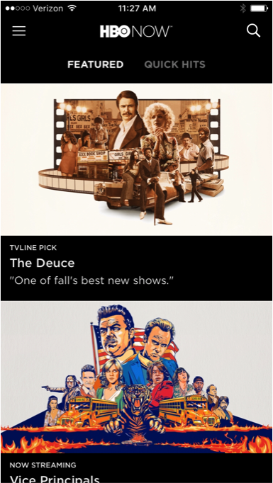
Poster carousal |
Thumbmail gallery |
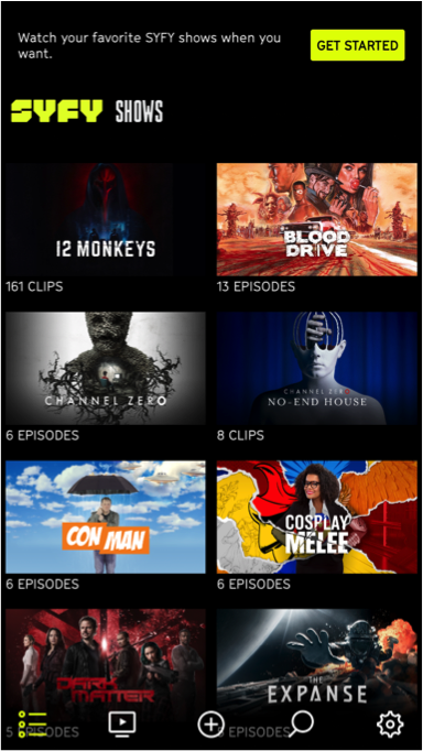
Featured content carousel and thumbnail gallery |
Poster carousel |
Featured content carousel and thumbnail gallery |
| Navigation Controls |
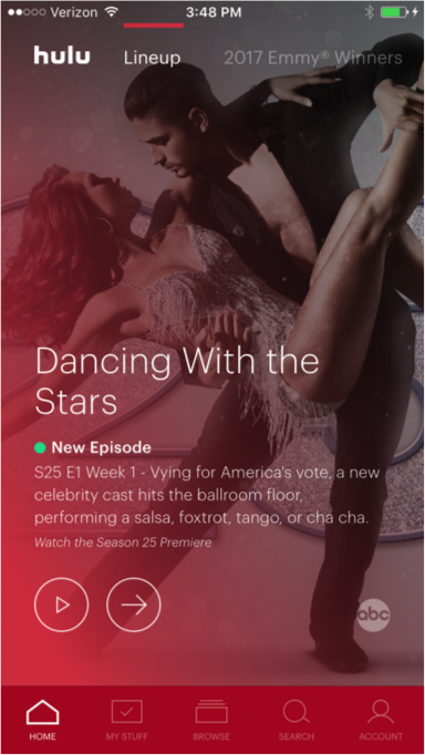
● Navigation bar at the bottom of the screen |
● Hamburger located in the top left corner
●Magnifying glass for search in top right corner
|
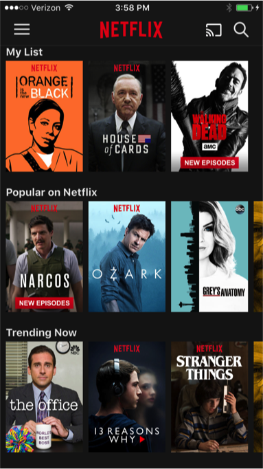
● Navigation bar at the bottom of the screen |
● Hamburger located in the top left corner
● Magnifying glass for search in top right corner
|
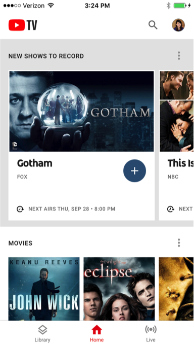
● Navigation bar at the bottom of the screen
● Magnifying glass for search in top right corner
|
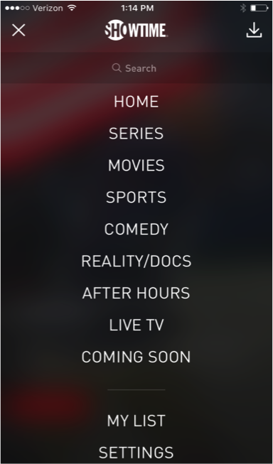
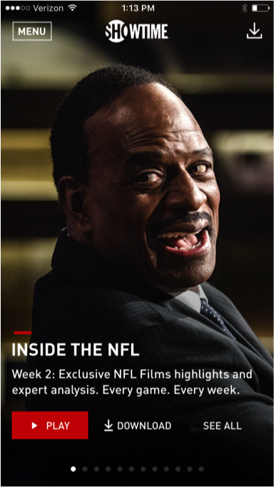
● ”MENU” button at the top left corner
●Download icon on the top right corner
|
● Navigation bar at the bottom of the screen
● Magnifying glass for search in top right corner
|
| Number of Videos |
8 |
2 |
1 |
9 |
9 |
1 |
1 |
| Global Navigation |
| Home button |
Located at the bottom navigation bar as a list icon |
Found when the hamburger is expanded |
Located at the bottom navigation bar as a home icon |
Found when the hamburger is expanded |
Located at the top menu bar adjacent to content selections |
Found when the “MENU” button at the top left corner expands |
Located at the bottom navigation bar as a home icon |
| Watchlist |
Located in the middle of the navigation bar as an icon with a cross inside a circle |
Found when the hamburger is expanded |
Located at the bottom navigation bar as a checkbox icon |
Found when the hamburger is expanded |
Located at the bottom navigation bar as a list icon |
Found when the “MENU” button at the top left corner expands |
Located at the bottom navigation bar as a library icon |
Account Access & Settings
|
Located at the bottom navigation bar as a gear icon |
Found when the hamburger is expanded |
Located at the bottom navigation bar as a user icon |
Found when the hamburger is expanded |
Located at the bottom navigation bar as a gear icon |
Found when the “MENU” button at the top left corner expands |
Located at the top right corner as a user icon (users can replace with their own photo) |
| hamburger menu |
 |
 |
|
|
|
|
|
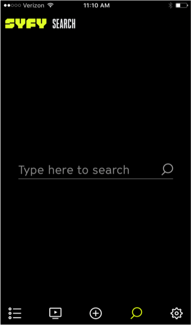
| Search |
● Located at the bottom navigation bar as a magnifying glass icon
● No search suggestions
|
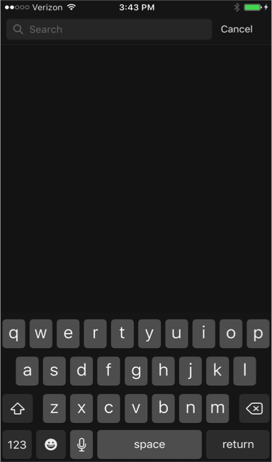
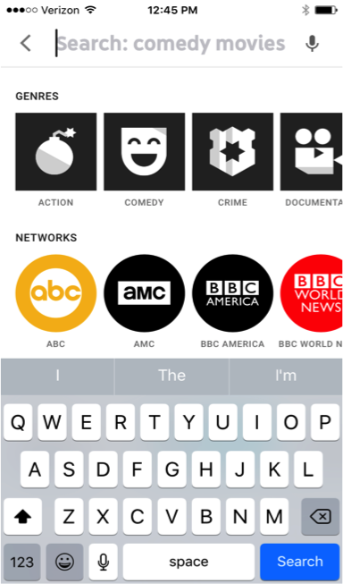
● Located at the top right corner of the screen as a magnifying glass icon
● No search suggestions
|
● Located at the bottom navigation bar as a magnifying glass icon
● Shows trending searches
|
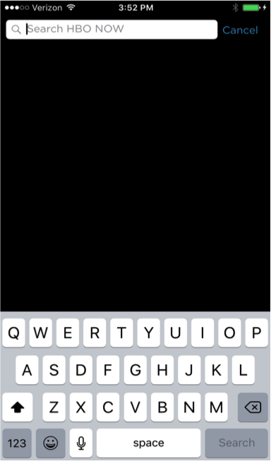
● Located at the top right corner of the screen as a magnifying glass icon
● No search suggestions
|
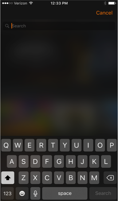
● Located at the top right corner of the screen as a magnifying glass icon
● No search suggestions
|
● Found when the “MENU” button at the top left corner expands
● Lists content types (i.e.,series, movies, sports) to aid searching |
● Located at the top right corner of the screen as a magnifying glass icon adjacent to user icon
● Lists many different categories with suggestions to aid searching |
| Search Examples |
 |
 |
 |
 |
 |
 |
 |


 Layouts & Global Navigation
 The navigation bar at the bottom of the screen is user-friendlier and reduces the number of clicks by allowing users to see all the controls at once while browsing content.